Hi, I’m Matthew Conlen, a researcher on the Intelligence Augmentation team at Midjourney, where I work at the intersection of machine learning and human-computer interaction. My interests include model control and interpretability, computational aesthetics, collective intelligence, data visualization, and personalized software.
I previously led the Product and Design team at Our World in Data, edited graphics at The New York Times where my work contributed to the 2021 Pulitzer Prize for Public Service, built user interfaces for Mars rover drivers at NASA Jet Propulsion Laboratory, and developed interactive data visualizations for clients including FiveThirtyEight, CNN, The New Yorker, The Pudding, and HHMI Janelia. My work has reached billions of people.
I hold a Ph.D. in computer science from the University of Washington (advised by Jeffrey Heer) and degrees in computer science and mathematics from the University of Michigan. My research has appeared at top venues including CHI, UIST, and IEEE VIS.
A few highlights
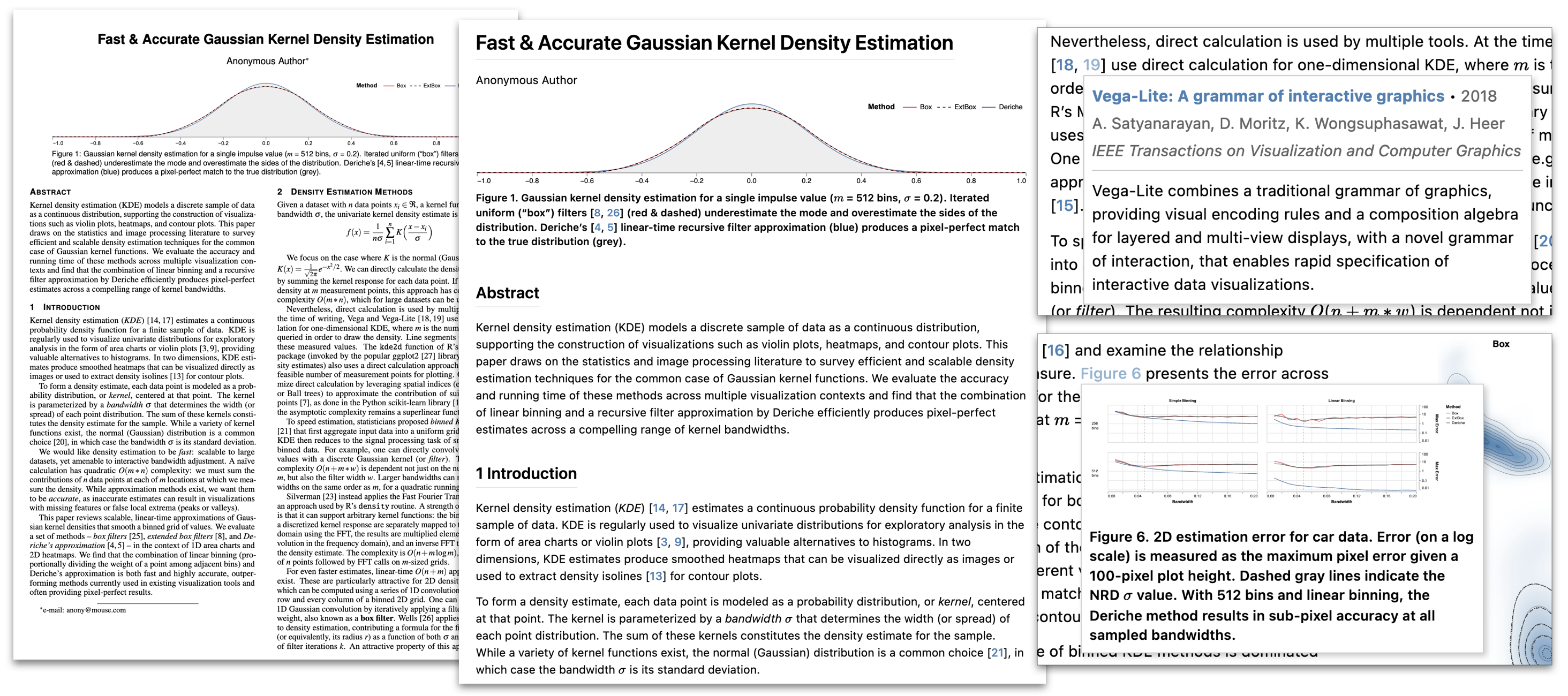
Living Documents. A long-running line of research into making documents on the web more expressive, interactive, and effective for education on complex topics. This work spans several projects: Idyll, a markup language for authoring interactive articles; Idyll Studio, a structured editor that makes interactive authoring accessible to non-programmers; and Living Papers, a language toolkit for augmented scholarly communication developed in collaboration with Jeffrey Heer.
Wordle Bot & Friends. Interactive tools built for The New York Times games platform. Wordle Bot analyzes your Wordle solution and compares it against optimal play, using information theory to evaluate each guess and show how efficiently you narrowed down the remaining possibilities. Spelling Bee Buddy offers real-time hints as you play, nudging you toward answers without giving them away. These are some of the most popular features on the Times games platform.

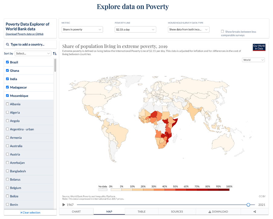
Our World in Data. As the first head of Product and Design at Our World in Data, I built the team from scratch, led the creation of a new design system for the site, redesigned the interactive data visualizations, and overhauled the publishing technology to support more expressive layouts and richer linkages between text and data.
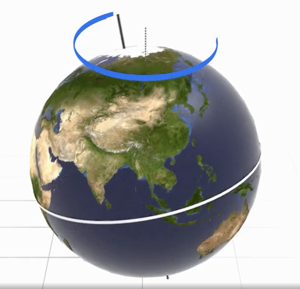
Cinematic Data Visualization. Research into how techniques from cinema, animation, and generative models can be applied to data-driven storytelling. This work examines how camera movement, lighting, pacing, and narrative structure from filmmaking can make data visualizations more engaging and easier to understand, and is now extending to the use of diffusion and edit models. Draws on collaborations with designers and filmmakers at NASA’s Jet Propulsion Laboratory and Art Center College of Design.
Overview • Visualizing Climate Change • CO2 Emissions • Milankovitch Cycles • Climate Migration
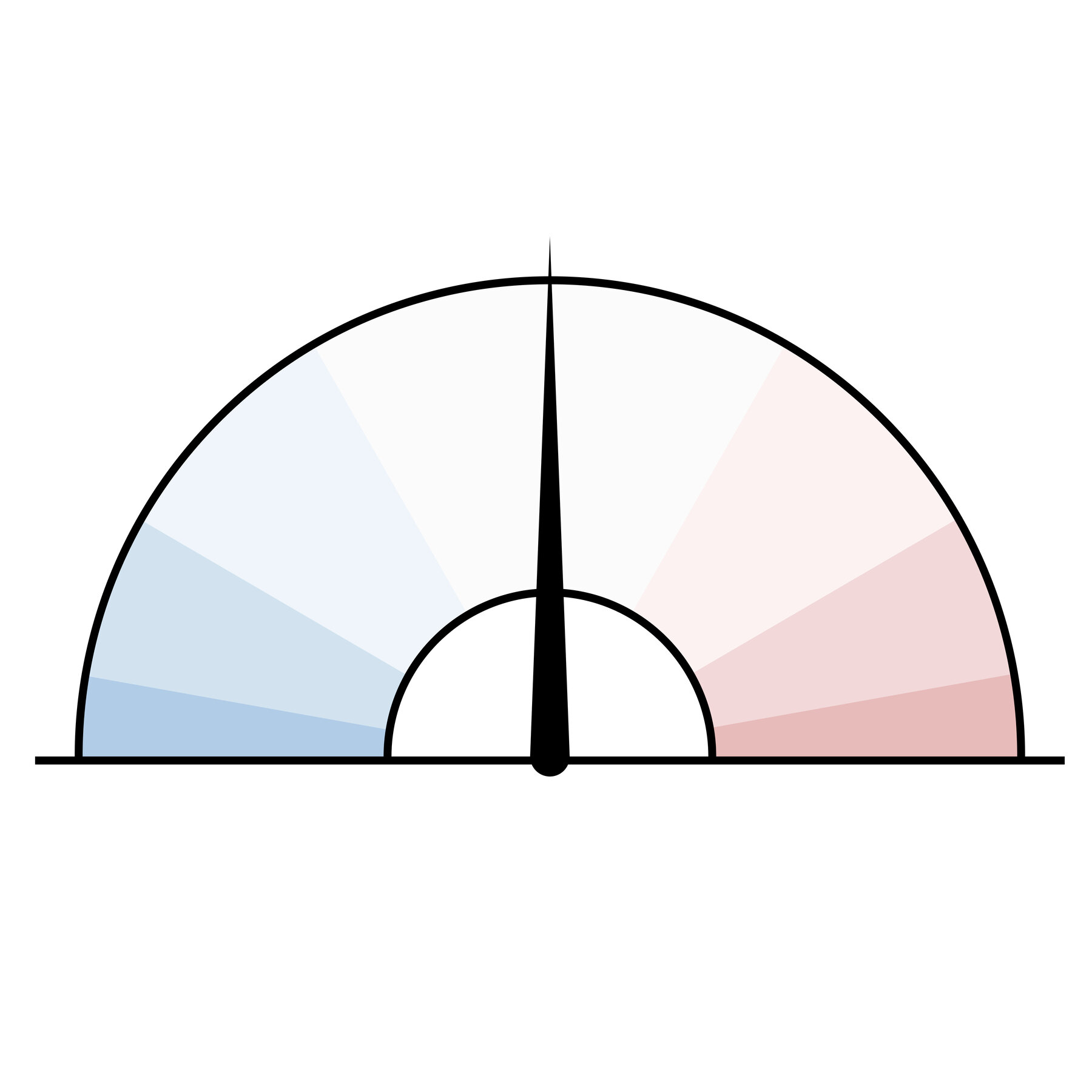
Election Graphics. Built real-time election results and forecast graphics for The New York Times, CNN, FiveThirtyEight, and Nate Silver across multiple election cycles. This includes the Times’ election needle, Nate Silver’s election forecast, live results dashboards, and interactive tools for exploring precinct-level data.